Jennifer Abel
24.04.2023Visualizing and analysing Neo4j data using NeoDash
This is a short bonus article to my Neo4j deployment series. If you followed along you probably know a lot about how to run Neo4j and NeoDash on Kubernetes now. In this article I will give a short example dashboard configuration with some visualizations. It will support management or operational departmants to get a fact-based overview of the current business values. Depending on how fast data will be saved to Neo4j this can be close to real-time.
For this purpose I created some sample data which can be inserted into Neo4j using these commands:
CREATE p1 = (:Order {id:'1'})-[:HAS_INVOICE]->(:Invoice {price: 100, id: '1', discount:5, invoicing_amount:95})
CREATE p2 = (:Order {id:'2'})-[:HAS_INVOICE]->(:Invoice {price: 200, id: '2', discount:5, invoicing_amount:195})
CREATE p3 = (:Order {id:'3'})-[:HAS_INVOICE]->(:Invoice {price: 100, id: '3', discount:5, invoicing_amount:95})
CREATE p4 = (:Order {id:'4'})-[:HAS_INVOICE]->(:Invoice {price: 200, id: '4', discount:5, invoicing_amount:195})
CREATE p5 = (:Order {id:'5'})-[:HAS_INVOICE]->(:Invoice {price: 100, id: '5', discount:5, invoicing_amount:95})
CREATE p6 = (:Order {id:'6'})-[:HAS_INVOICE]->(:Invoice {price: 200, id: '6', discount:5, invoicing_amount:195})
CREATE p7 = (:Order {id:'7'})-[:HAS_INVOICE]->(:Invoice {price: 1000, id: '7', discount:100, invoicing_amount:900})
CREATE p8 = (:Order {id:'8'})-[:HAS_INVOICE]->(:Invoice {price: 800, id: '8', discount:10, invoicing_amount:790})
MATCH (o1:Order {id:'1'}),(o2:Order {id:'2'}),(o3:Order {id:'3'}),(o4:Order {id:'4'}),(o5:Order {id:'5'}), (o6:Order {id:'6'}), (o7:Order {id:'7'}), (o8:Order {id:'8'})
MERGE (c1:Customer {name:'Eiffeltum',longitude: 2.2668765, latitude: 48.8529209, location: 'Paris'})-[:HAS_ORDERED]->(o1)
MERGE (c1)-[:HAS_ORDERED]->(o2)
MERGE (c2:Customer {name:'synyx',longitude: 8.3844571, latitude: 49.0038173, location: 'Karlsruhe'})-[:HAS_ORDERED]->(o3)
MERGE (c2)-[:HAS_ORDERED]->(o4)
MERGE (c3:Customer {name:'Brandenburger Tor',longitude: 13.0951145, latitude: 52.5068042, location: 'Berlin'})-[:HAS_ORDERED]->(o5)
MERGE (c3)-[:HAS_ORDERED]->(o6)
MERGE (c3)-[:HAS_ORDERED]->(o7)
MERGE (c3)-[:HAS_ORDERED]->(o8)
Dashboard explanation
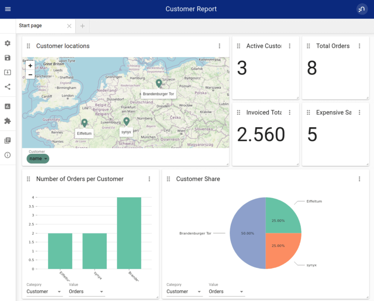
KPIs will be about Customer data will be included in the dashboard. Since our example dataset includes 3 Customer, we will display them on a map. With this help we can analyse geographical distribution of our customers and may find out about marketing oppertunities.
These 3 Customers did a total amount of 8 Orders which resulted in a total invocing amount of 2.560. 5 Orders were more expansive than 100.
If you want to analyse how the orders are divided between different customers, it will be displayed in a bar chart. For Key Account Managing a pie chart will display the share on the Ordercount of a customer to know what important Customer to focus on most.
The dashboard defintion in JSON
{
  "title": "Customer Report",
  "version": "2.2",
  "settings": {
    "pagenumber": 0,
    "editable": true,
    "fullscreenEnabled": false,
    "parameters": {}
  },
  "pages": [
    {
      "title": "Start page",
      "reports": [
        {
          "title": "Customer locations",
          "query": "MATCH (c:Customer) RETURN c;\n",
          "width": 6,
          "height": 2,
          "x": 0,
          "y": 0,
          "type": "map",
          "selection": {
            "Customer": "name"
          },
          "settings": {}
        },
        {
          "title": "Active Customers",
          "query": "\nMATCH (n:Customer) RETURN count(n);\n\n",
          "width": 2,
          "height": 1,
          "x": 6,
          "y": 0,
          "type": "value",
          "selection": {},
          "settings": {}
        },
        {
          "title": "Total Orders",
          "query": "MATCH (o:Order) RETURN count(o);\n",
          "width": 2,
          "height": 1,
          "x": 8,
          "y": 0,
          "type": "value",
          "selection": {},
          "settings": {}
        },
        {
          "title": "Number of Orders per Customer",
          "query": "\n\nMATCH (c:Customer)-[e]->(o:Order)\nRETURN c.name as Customer, COUNT(o) as Orders\n",
          "width": 4,
          "height": 2,
          "x": 0,
          "y": 2,
          "type": "bar",
          "selection": {
            "index": "Customer",
            "value": "Orders",
            "key": "(none)"
          },
          "settings": {}
        },
        {
          "title": "Customer Share",
          "query": "\n\nMATCH (c:Customer)-[e]->(o:Order)\nRETURN c.name as Customer, COUNT(o) as Orders\n\n\n\n",
          "width": 6,
          "height": 2,
          "x": 4,
          "y": 2,
          "type": "pie",
          "selection": {
            "index": "Customer",
            "value": "Orders",
            "key": "(none)"
          },
          "settings": {}
        },
        {
          "title": "Invoiced Total",
          "query": "MATCH (o:Invoice) RETURN SUM(o.invoicing_amount)\n\n\n",
          "width": 2,
          "height": 1,
          "x": 6,
          "y": 1,
          "type": "value",
          "selection": {},
          "settings": {}
        },
        {
          "title": "Expensive Sales",
          "query": "\nMATCH (o:Invoice) WHERE o.price>100 RETURN count(o)\n\n",
          "width": 2,
          "height": 1,
          "x": 8,
          "y": 1,
          "type": "value",
          "selection": {},
          "settings": {}
        }
      ]
    }
  ],
  "parameters": {},
  "extensions": {}
}